

UNITED STATES—When putting together an event poster, it is important to consider a variety of factors that will impact the overall look and feel of the finished product. So if you’re wondering what you should consider when using a poster maker, here’s a list of things to put on your poster, and the best way to present it.
Using The Right Words For The Title
Try to use the words “event”, “meetup”, or other common terms instead of long, drawn-out titles. Use colored fonts in your free poster maker for an eye-catching effect!
Have Clear Graphics
Make sure your graphics are clear and easy to read. Using words or numbers will make this easier for people who aren’t interested in your event, but still need to see if there is anything worth their time.
Include Details
Write out what will be happening or what the event is about/for, and how long it will last. If your details are boring people may not want to attend your event. Make your words interesting by using variations of regular and irregular fonts and sizes, and make sure the dates and times are clear.
Also, when using an online poster maker, be clear with the dates and times of the event. Better yet, try to make it accessible on smartphones as well! If you’re particularly good at graphic designing, you can even create an app for people to download so they always have the information on them.
However, while making sure there is a good amount of detail on the poster, don’t add too much! If it’s too hard to see what you’re trying to put up, people won’t attend your event. But if they do, and you’ve gone overboard with the information – then no one knows what they’re supposed to be doing!
Have Proper Spacing
Don’t go overboard with the amount of information on your poster. If it’s too hard to see what is happening, or even who it’s for, people won’t attend. Be concise enough that they know exactly what will be happening (and where), but detailed enough that they can get a feel of what it will be like.
Choosing Colors And Fonts
It’s best to go with light-colored paper for your poster, so make sure the colors you use stand out! If there is too much going on in your poster it will be hard to see what’s happening. Try using only two types of graphics per event, along with two main colours. You can also use a white background and black text, or vice versa.
As for fonts, the best ones to use are sans-serif fonts, however, don’t limit yourself to only using these! Try implementing serif fonts as well, or different weights of sans-serif fonts. You can even try hand-drawn or handwritten text if you want your poster to stand out more.
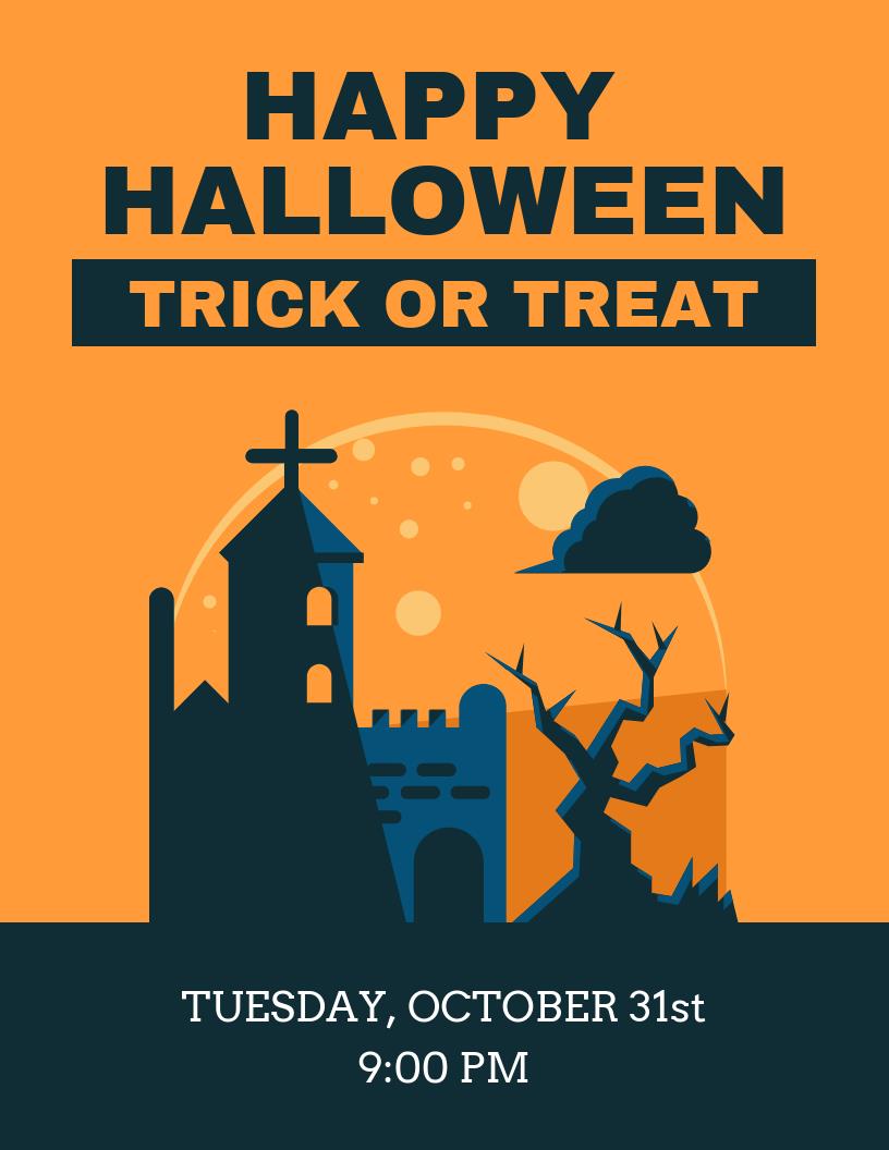
Choosing a Theme and Design
Try using themed posters so your posters all look alike. If you decide to do this in a custom poster maker, try repeating themes throughout the poster. For example, if your first poster of the year includes a black background with blue text and graphics, try doing that again on another one of your posters for the year.
You can also try using a common theme throughout all of your posters. If you have themed posters for Halloween or Christmas, try the same themes again the following year. This way it will be recognisable and people will know exactly what to expect from your event! Also if you keep your fonts and graphics similar, they’ll be easier to recognise as well.
Make sure the layout is good! In other words, don’t have text that is too big or too small on a poster. Make sure the shapes and sizes of the graphics match up to each other as well. Try and keep it simple and readable!
If you’re looking for a poster maker app with a wide variety of options, check out Venngage.
Deciding on Length and Size
Much like in making a brochure, try not to make your poster too long. If it’s too hard to read, people will get annoyed and leave the poster – which is exactly what you don’t want! Keep things short, sweet and simple.
It’s best to go with 33 cm x 23cm for your posters. However, if this isn’t possible for you, 35 cm x 25cm will do as well. Try and keep this in mind when designing your posters!
Knowing Where to Place the Poster
Try putting the poster somewhere where people are seen to walk past. High-traffic areas are ideal, so parents can tell their kids to go to your event after school! Make sure the background is clean and easy to read, otherwise you won’t get many attendants.
Make sure your posters relate to each other. This means putting them in similar places (e.g. on notice boards) and having them use similar styles of graphics and designs.
In Conclusion
Your poster should ultimately be memorable, so if it is something people can remember, they will most likely go to your event! Be creative at the same time as being concise and clear – If you can do this you’ll have a great event poster!


